Lijjat Papad - Same Crunch, New Attitude?
Helping first-time homebuyers actually understand what they're looking at.
BRANDING
BRAND GUIDELINES
Role
Designer
Timeline
3 weeks
team
me
platform
Branding

The brief I set for myself
Lijjat has been in Indian kitchens since 1959. Everyone knows it. Most households have bought it at least once. It's trusted, affordable, handmade, and deeply rooted in Indian culture. It's also, visually, stuck in another era.
The brief I set for myself: what would Lijjat look like if it were rebranded for a new global audience, without losing what made it iconic in the first place?
The goal wasn't to erase Lijjat's heritage. It was to give it a visual language worthy of what it already is.
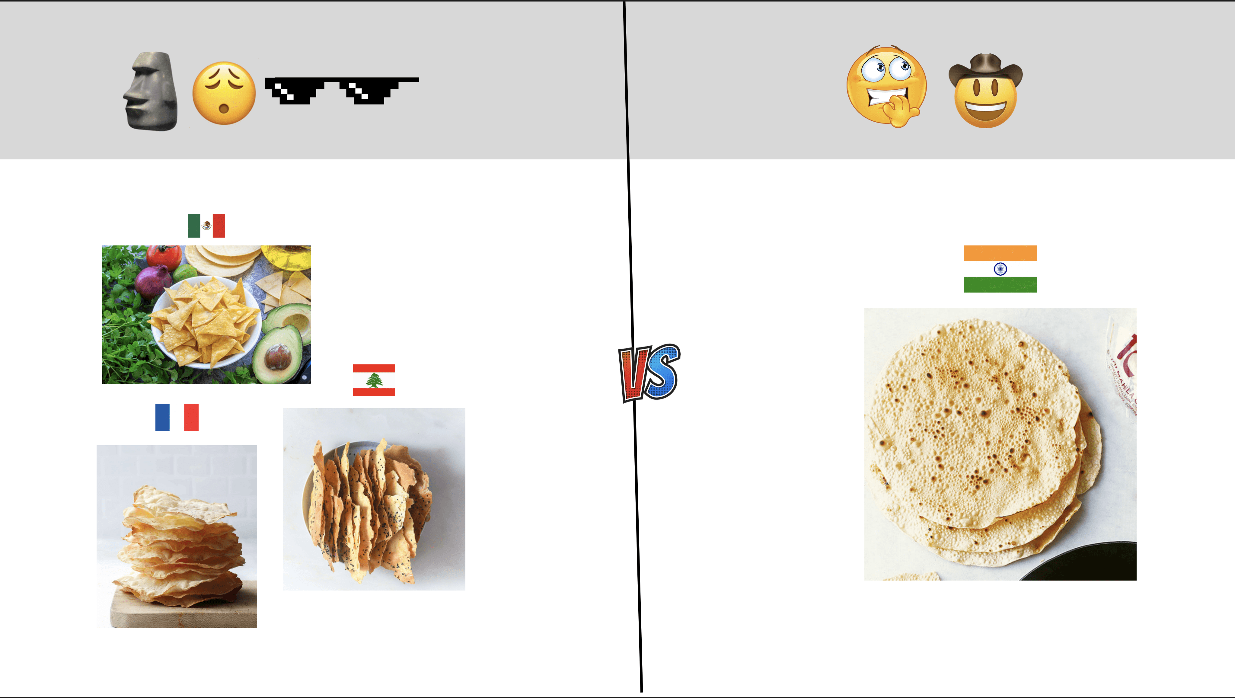
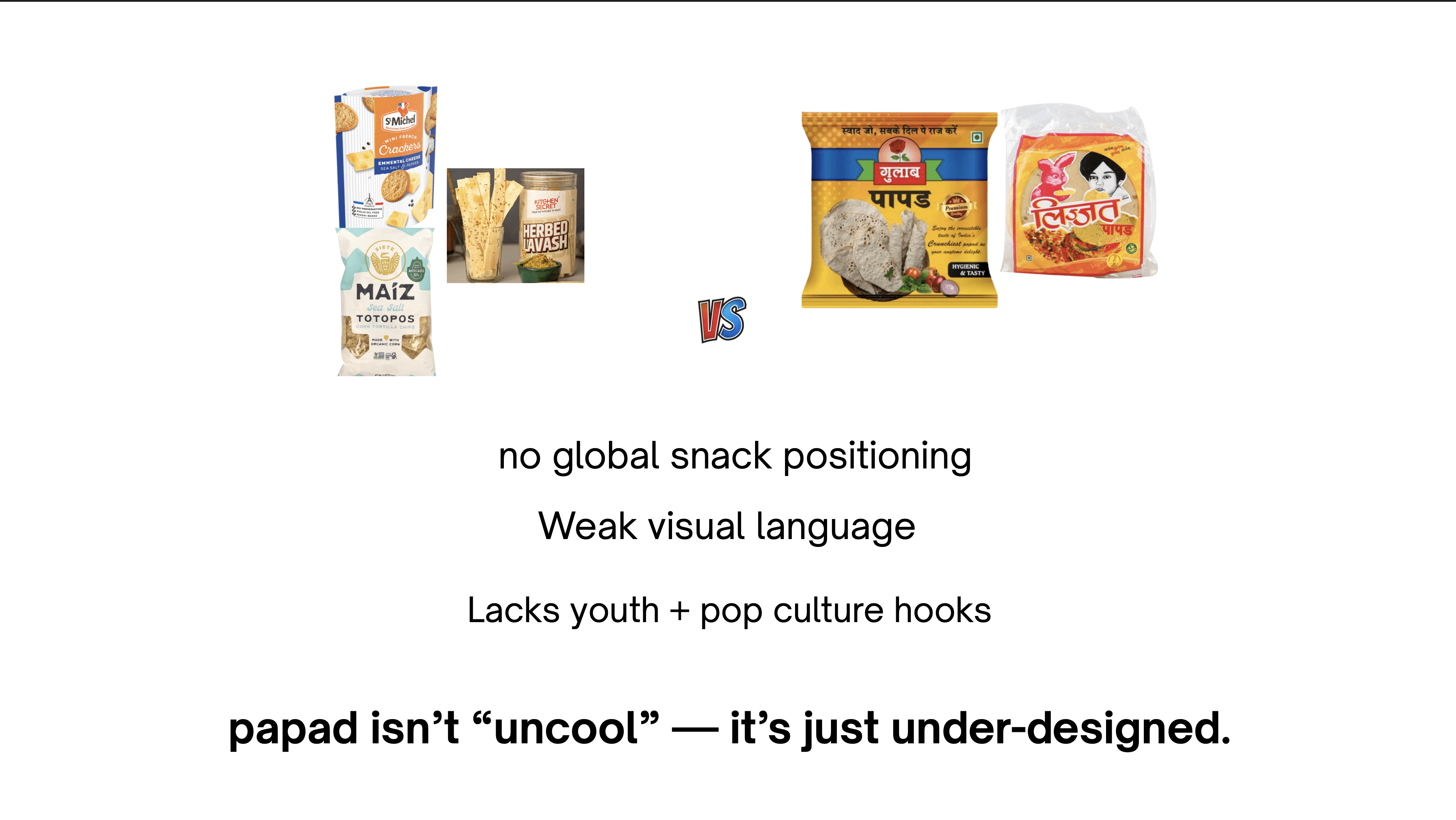
Research & Insight - The core tension was clear early on. Papad sits alongside nachos, lavash, and crackers on the global snack shelf, but it doesn't look like it belongs there. That's not a product problem. The product is genuinely good. It's a design problem.
Three gaps stood out:
No global snack positioning. The original packaging speaks to people who already know what Lijjat is. It doesn't invite anyone new in.
Weak visual language. The existing identity has no consistent system behind it. No clear colour logic, no typographic hierarchy, no brand personality that translates across touchpoints.
No youth or pop culture hooks. Papad isn't uncool. It's just under-designed. A brand born from community, craft, and women-led enterprise has an incredible story to tell, it just wasn't being told visually.
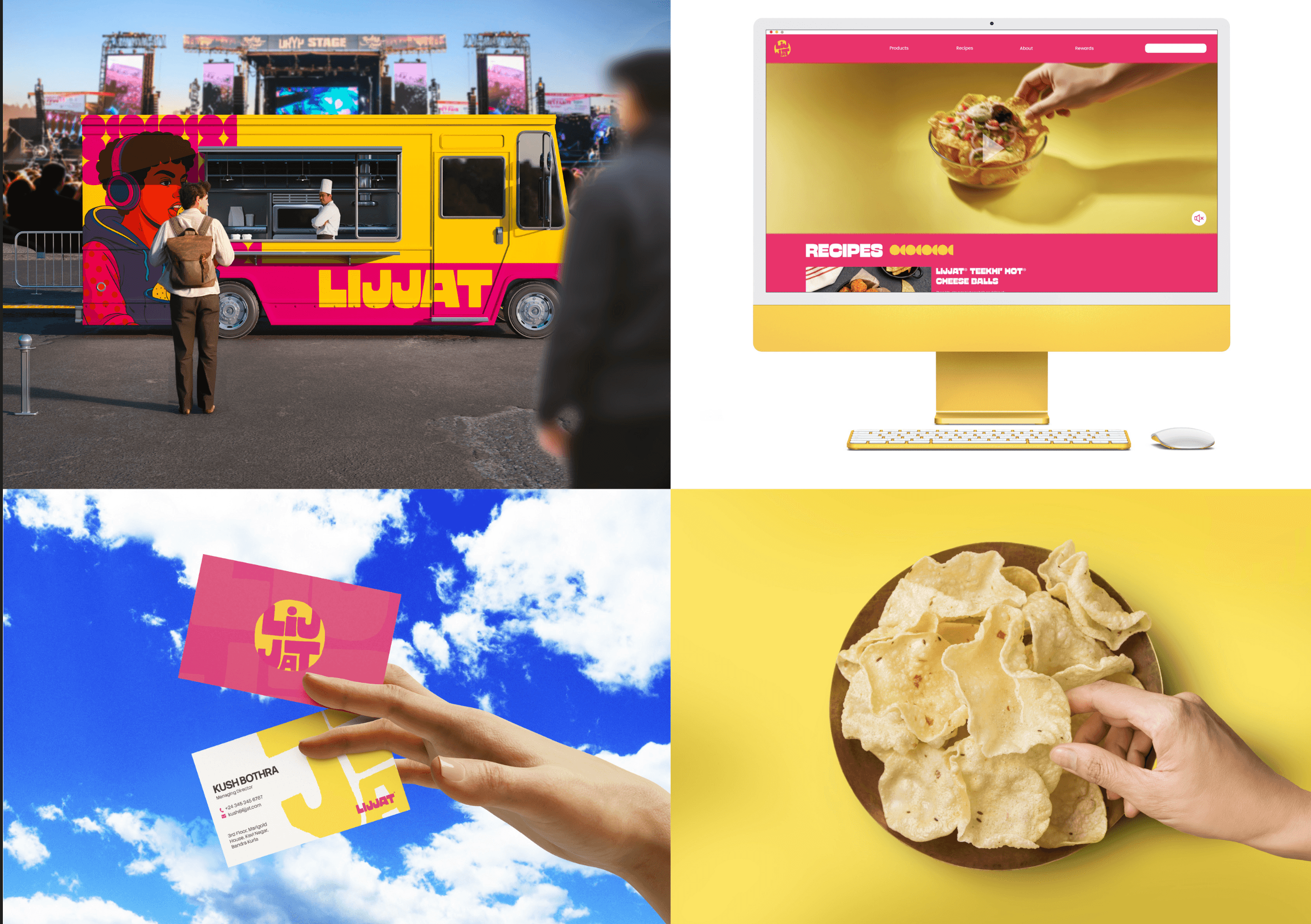
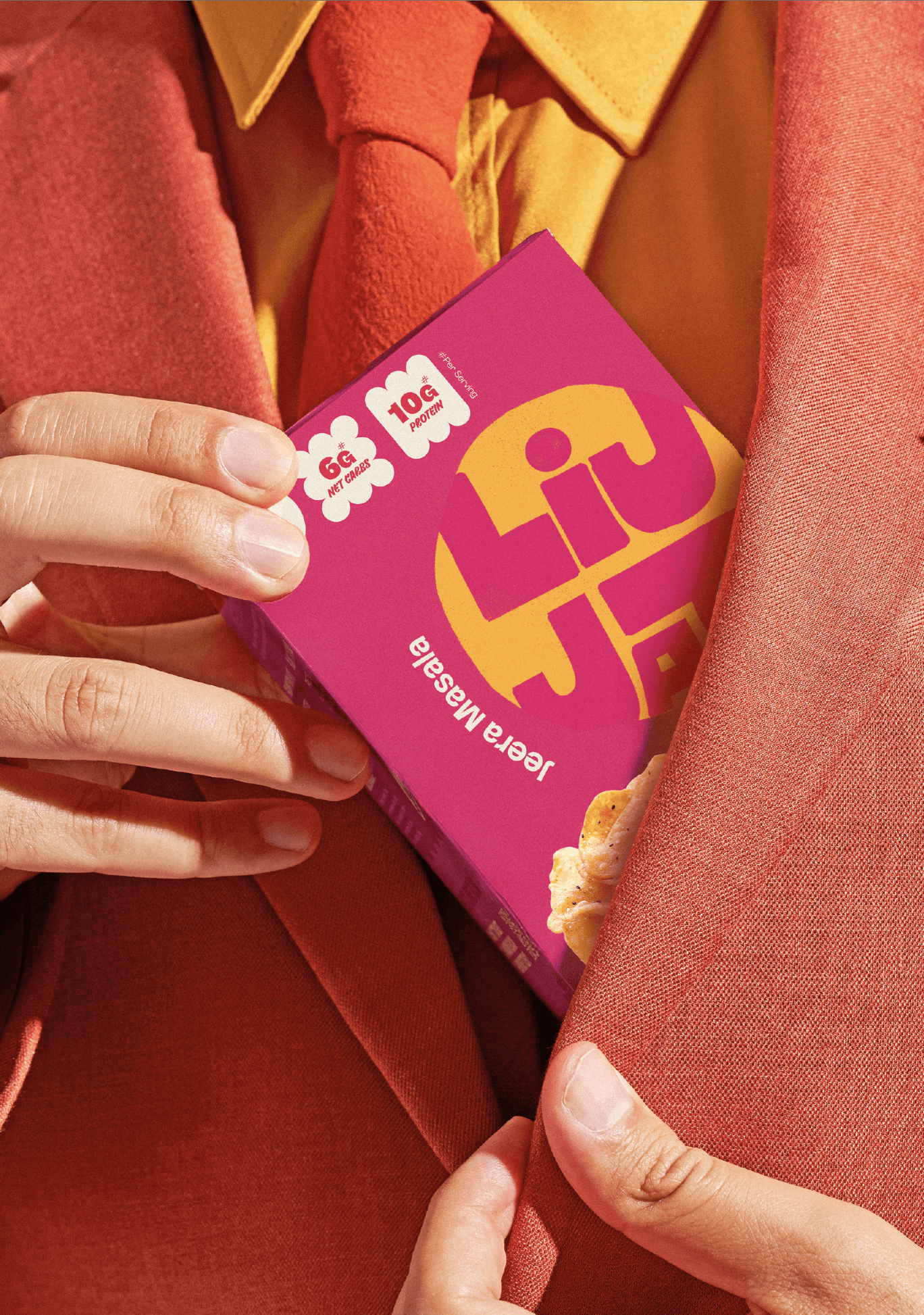
The repositioning: transform Lijjat into a Gen Z-friendly global snack brand. Position papad and khakra as Indian gourmet crisps for modern fusion. Keep the soul, rebuild the skin.

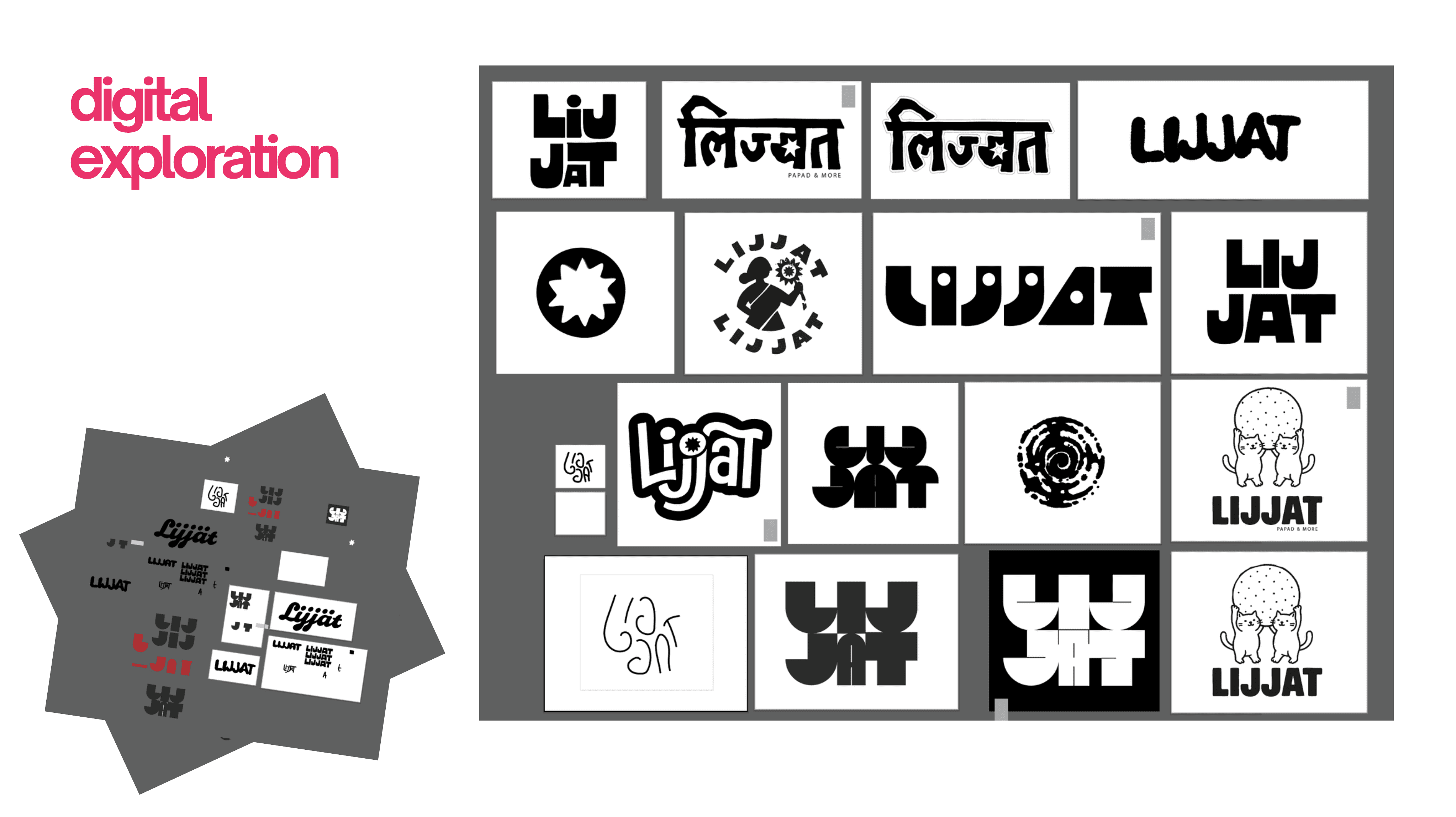
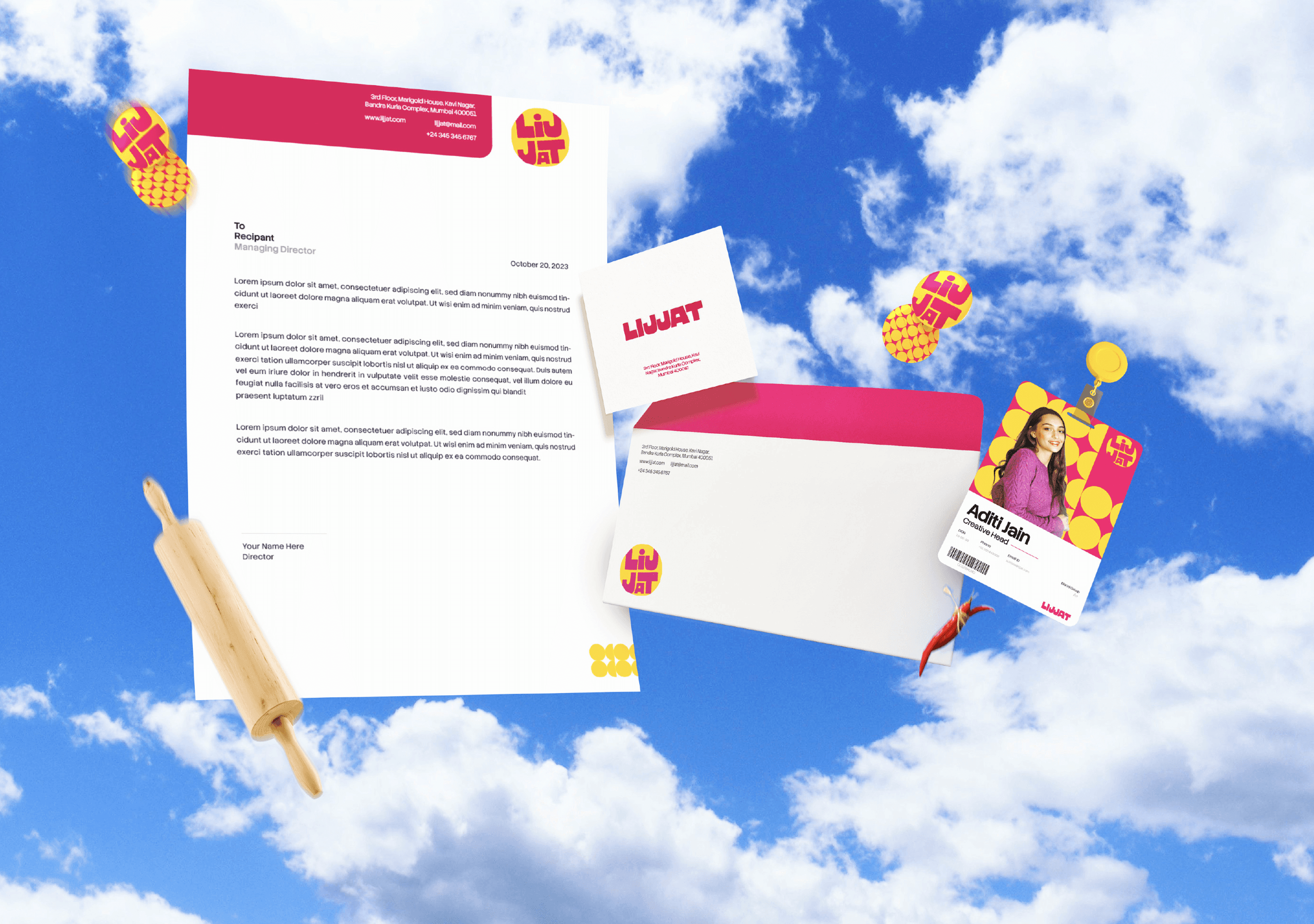
Logo & Brand System
I started with sketches, rolling pins, suns, hands, the women behind the brand, the circular papad form. After dozens of hand-drawn explorations, I moved into digital, trying Devanagari treatments, illustrated characters, stacked wordmarks, and badge lockups. What I landed on was a bold, stacked LIJ / JAT wordmark with chunky, hand-cut letterforms inside a circular form inspired by the papad itself. Intentionally imperfect texture, street-style energy, something you'd spray-paint on a wall.
The colour palette is pulled straight from Indian streets and kitchens, and every colour has a name that earns it: Haldi Yellow, Rani Pink, Jamuni Raat, Malai White, Neelam Blue. Typography runs across three weights of GW Primos and Stack Sans, with hierarchy that gets louder as it gets bigger. The pattern system is built from the papad's circular form, repeated and layered across touchpoints. The icon library and illustration style do the same thing the logo does, bridging desi culture and global youth aesthetics, like something you'd see on a festival poster.